

Contains 100% toxins
Mission: Create the most toxic energy drink ever known to man.
AGENT ORANGE is a product to push the limits of the flagrant, bombastic (and borderline offensive) energy drink space. Part fine arts piece, part social commentary, this consumer good shouldn't be sold, but it probably could sell in America.
Graphic Design, Branding, Art Direction: Cora Veltman


THE BARREL BOX
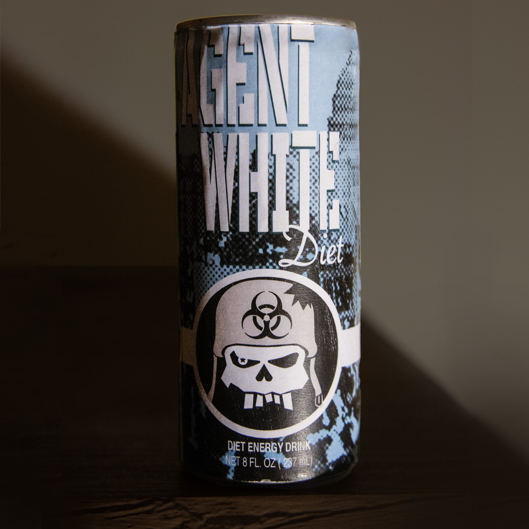
Between 1965 - 1971, the United States Government produced and used over 20 million gallons of Agent Orange. The powder was delivered in barrels. While Orange was the most commonly used at that time, the military commissioned numerous chemical warfare properties called ‘rainbow herbicides’. Agents Pink, Blue, Orange, Green, Purple, and White were each designed with a specific purpose. A colored stripe around the barrel was the only way to distinguish whether the barrel was intended for deforestation, destruction of food crops, to be used as a human deterrent.


The Agent Orange can image depicts a helicopter with soldiers scene while the Agent White (Diet) flavor features an image of the protests that were happening in Washington D.C. during this time.
CAN OF DEATH


I grew up fascinated by the 1960s. Style, music, art- the United States was in a unique period of transition. The 60s bleeding into the 70s contains so much context because of friction. I became conflicted in my love for this period and started connecting the dots between the things that inspired me and the unrest that art was in response to.
Agent Orange was born out of a dichotomy of disgust in my nation’s history and my love of innovations in art at this time. Rebellion, recycling, and rebirth.
This project is in memory of Professor Robert Sirko.
How’s my kerning?

